

The economy isn't broken. It’s working exactly as designed.
Why are our rivers full of sewage while private wealth keeps soaring? Why do essential workers struggle to survive in one of the richest countries on Earth?
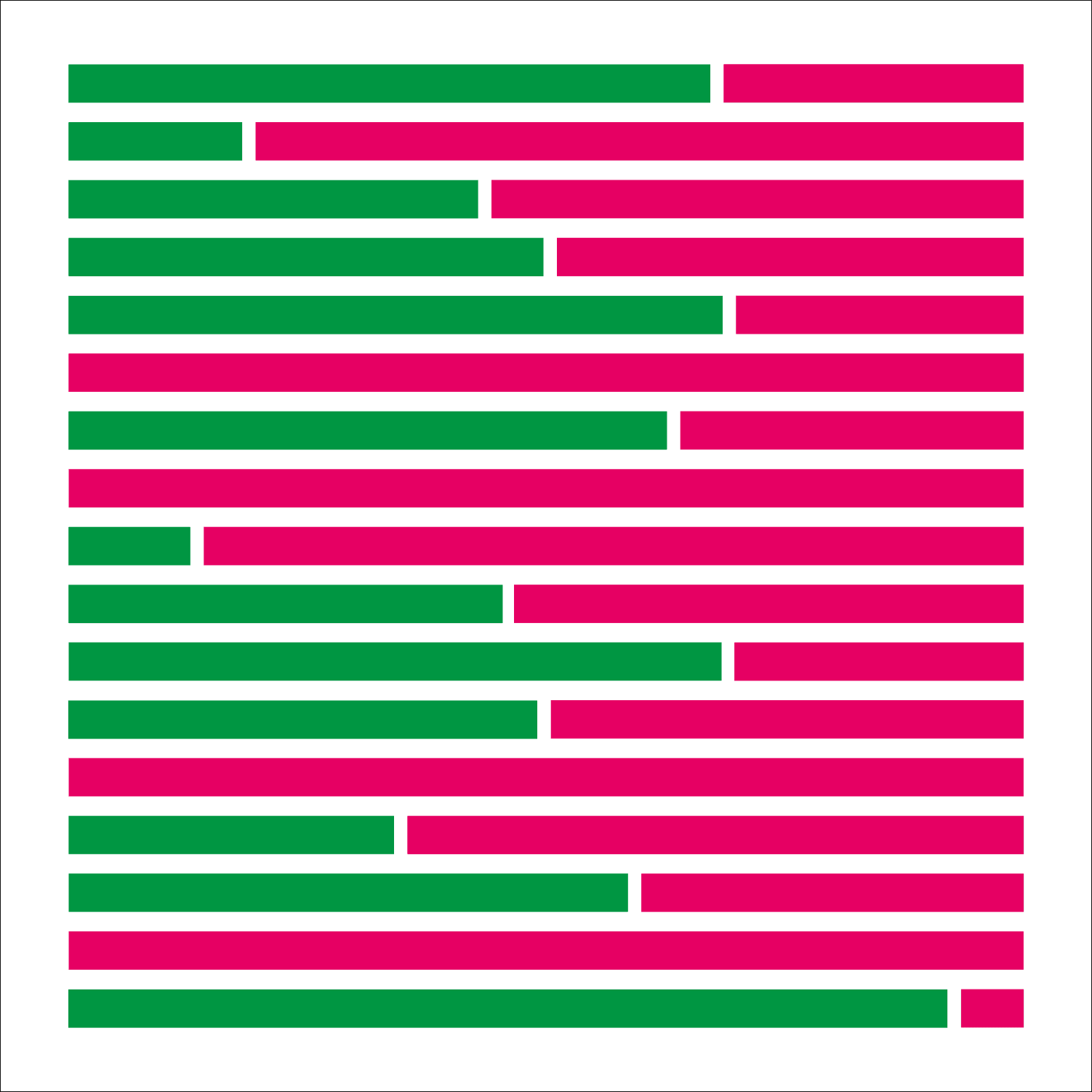
These images reveal the hidden systems shaping modern Britain, who benefits from them, and who pays the price.
Explore the image collection below or watch Martin Whitlock’s video series.


Reveal the hidden forces that drive inequality, wealth, and value.
Each image uncovers a system most people sense, but rarely see clearly:
how wealth moves, how power concentrates, and why public life feels increasingly fragile.

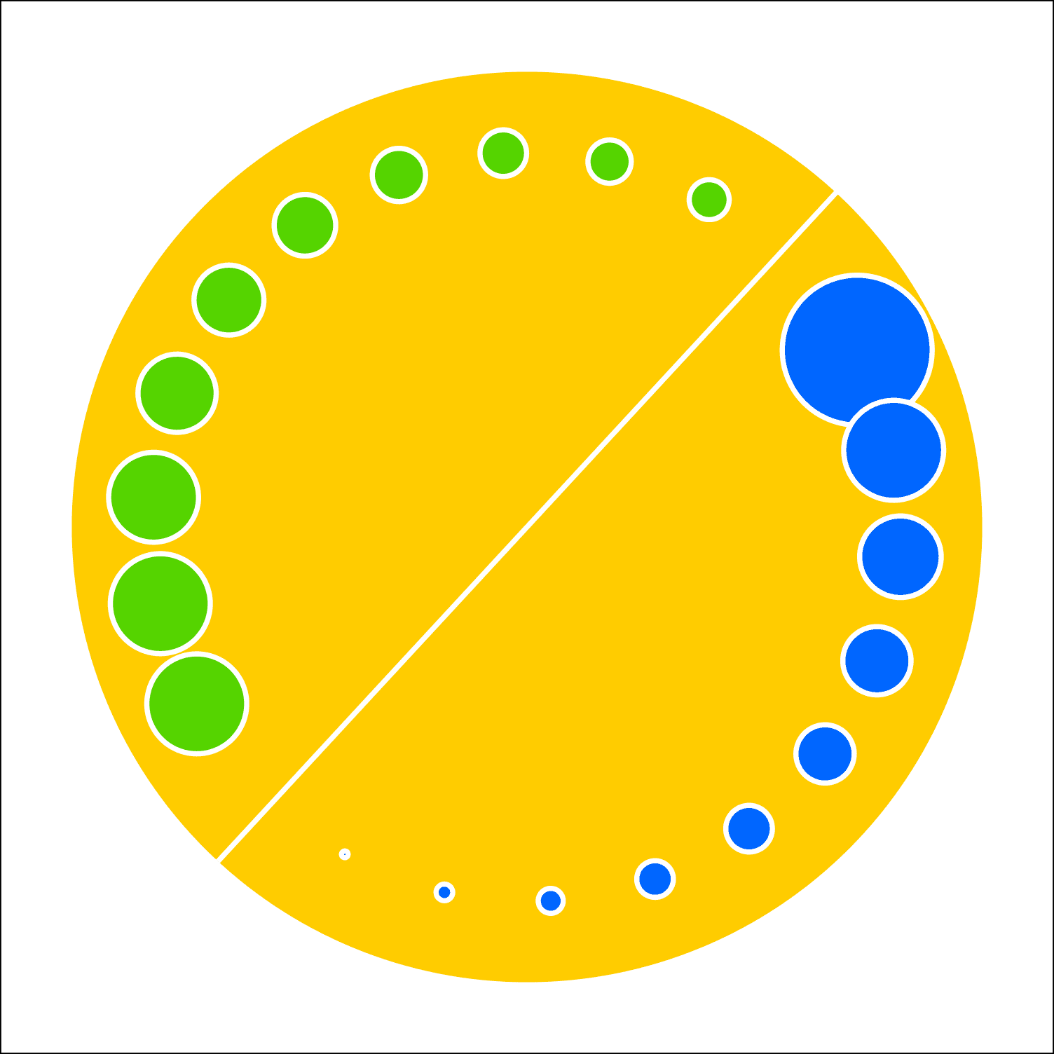
Going, going
The UK is selling itself to the highest bidder
The change in ownership of UK quoted shares between 1981 and 2022. UK insurance and pension funds are in green; private UK investors are in blue; foreign ownership is in pink.
Learn More

Falling over
The Economy’s Wobbly Foundations
The image shows the number of people employed in manufacturing (orange) and financial services (blue), with the relative amount of tax per person paid in each of those sectors (green and pink)
Learn More
Sharing plates
A little equality goes a long way
The image shows the wealth of each 10% of the population of Grest Britain, in the blue circles. The circles in green show the effect of distributing the additional wealth of the top 10% equally among the lower 80%.
Learn More
Trading Excesses (Snail no. 2)
Why are we paying for trading activity that we don’t need?
The head of the snail shows the requirement for foreign currency exchange to support UK imports and exports. The actual volume of sterling traded in London is shown in yellow. The total of all currencies traded in London is shown in pink.
Learn More

Boardroom Excesses (Snail no. 1)
Are top bosses paid to do the wrong thing?
The head of the snail shows typical worker pay. This is compared with the pay of top chief executives in 1980 (yellow) and 2022 (pink).
Learn More
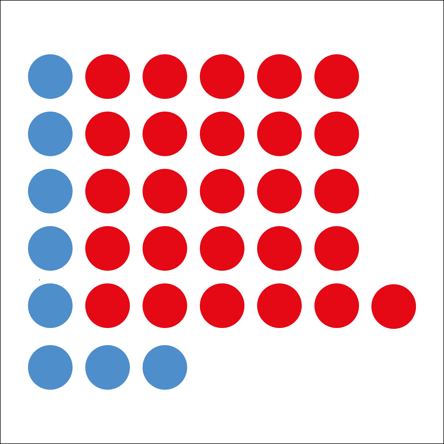
The rise in small print
Are we paying for more lawyers than we need.
The number of solicitors per 10,000 people in England and Wales in 1981 (blue) and 2022 (red). The great majority work in commercial transactions.
Learn More

We all pay for everything
How we are forced to pay for things that we don’t want.
Paid economic activities in the UK economy from most productive to least productive in terms of real value. Agriculture and manufacturing are the first two on the left; financial services and property are the last two on the right.
Learn More

A slippery slope
The decline of making and doing
UK paid economic activity, 1950 (left) and 2015 (right). Green is the production of real new wealth; red is the transacting of existing wealth such as property and finance. Yellow is some and some.
Learn More

Is not Equal
Poorer children do worse at school
Pupils in England achieving a pass grade in English and maths. Those eligible for free school meals are shown in green; those from better-off families (who are not eligible) are shown in yellow. A third of all children (shown in blue) did not achieve this standard.
Learn More
A life cut short
Inequality has real consequences
Healthy life expectancy in Britain in areas of least deprivation, shown in green, and areas of greatest deprivation, shown in red. The difference is 20 years.
Learn More
You call that work?
Unpaid work is valuable, too
Paid and unpaid work in the UK economy, in money terms. Red is paid; green is unpaid. Unpaid includes care of adults and children, cooking, cleaning, driving, DIY and volunteering.
Learn More

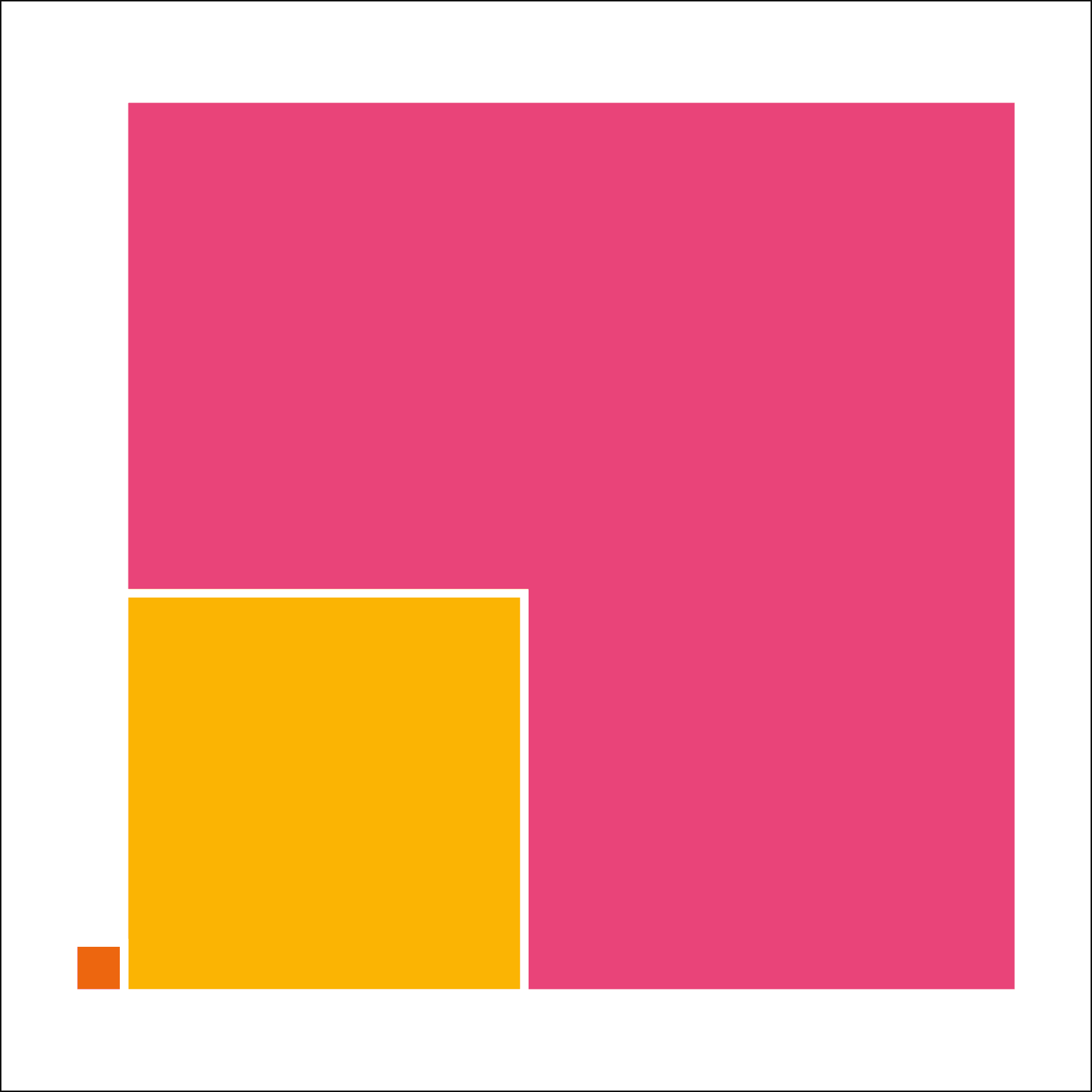
The family silver
The privatisation of the UK’s public utilities has caused a colossal transfer of money from ordinary families to the already-rich.
The blue area shows the sale proceeds when the UK water industry was privatised in 1989. The green area shows the dividends paid to the new owners between 1989 and 2019.
Learn More
Political art for people who want to understand what’s really happening
These twelve illustrations expose the systems shaping modern Britain, from privatisation and housing to debt, extraction, and inequality.
Designed as striking visual postcards, each piece turns a complicated economic story into something immediate, memorable, and impossible to unsee.
Also vailable as prints and T-shirts.
